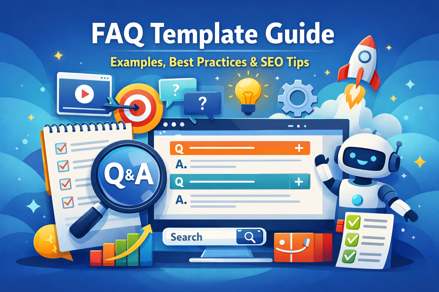
If you think FAQ pages are just a boring list of questions at the bottom of your site, think again.
Research shows that around 85% of customers use a company’s website as their go-to source of information, and over half of them (53%) prefer self-service tools like FAQ pages instead of waiting for a support agent. In today’s fast-moving, AI-powered world, people expect answers now—not “within 24–48 business hours.”
That’s exactly where a well-built FAQ page becomes a powerhouse.
Done right, your FAQ section does more than answer questions. It improves user experience, reduces support tickets, and boosts your visibility in search results—including SERP features like People Also Ask and AI-generated responses from large language models (LLMs).
In this guide, we’ll walk through:
-
What an FAQ template is
-
Different types of FAQ formats you can use
-
Why FAQ templates are so powerful for customer service
-
Must-have elements of a high-performing FAQ page
-
Where to publish your FAQs for maximum impact
-
18 real-world FAQ template examples from top brands
-
5 best practices for creating your own FAQ page
-
Common mistakes to avoid
By the end, you’ll have a clear blueprint to build an FAQ page that not only answers questions but also drives conversions and builds trust.
What Is an FAQ Template?
Let’s start at the beginning: what are we really talking about when we say “FAQ template”?
An FAQ template is a structured layout or framework you use to present frequently asked questions and their answers on your website. It’s the section where you address recurring queries about your:
-
Products
-
Services
-
Policies
-
Billing and shipping
-
Technical issues
The main goal? Make life easier for your customers.
Instead of forcing people to send emails, open tickets, or wait on chat, a strong FAQ template lets them find clear, concise answers on their own in a few clicks. That saves your team time, and it saves your users a lot of frustration.
Most FAQ pages group questions into logical categories—think:
-
Account management
-
Payments and billing
-
Shipping and delivery
-
Returns and refunds
-
Troubleshooting
These categories act like signposts so users can quickly jump to the part that matters to them. When that happens, their experience with your brand improves dramatically.
Types of FAQ Templates You Can Use
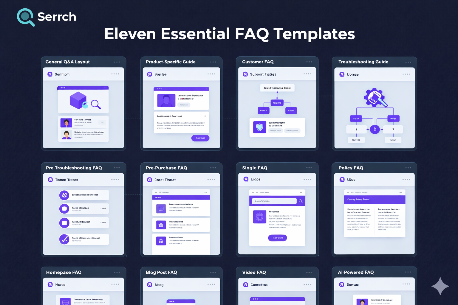
There’s no one-size-fits-all layout for FAQs. Different businesses, audiences, and products call for different formats.
Here are some of the most common FAQ template types you can mix and match.
1. General Q&A Layout
This is the classic FAQ style: a list of questions and answers on a single page. It’s simple, clean, and works well for smaller sites or businesses just getting started.
Use it when:
-
You have a limited number of questions
-
Your audience isn’t highly technical
-
You want something easy to maintain
2. Product-Specific FAQ
Here, each product or service gets its own mini FAQ section. Think of it as a “FAQ per product” approach.
It’s ideal when:
-
You sell multiple products with different features
-
Each product generates its own set of questions
-
You want to answer buying objections right on the product page
3. Troubleshooting Guide FAQ
This format focuses on common issues, errors, or problems users face and how to solve them step by step.
It works best for:
-
Software and SaaS tools
-
Tech products and electronics
-
Platforms with complex configurations
4. Customer Service FAQ
These FAQs zoom in on support-related questions, like:
-
“How do I contact support?”
-
“What are your response times?”
-
“Can I change or cancel my order?”
They’re often combined with links to live chat, support tickets, or help centers.
5. Policy and Compliance FAQ
If your business deals with legal, regulatory, or sensitive information (think healthcare, finance, or privacy), you’ll probably need a policy-focused FAQ.
You might cover:
-
Data privacy and GDPR
-
Refund and cancellation policies
-
Terms of service and legal disclaimers
6. Pre‑Purchase Inquiry FAQ
These FAQs live close to your sales funnel and answer questions potential customers ask before they buy:
-
“Is there a free trial?”
-
“Do you ship internationally?”
-
“What payment methods do you accept?”
Nail this FAQ, and you’ll remove a lot of friction from your checkout process.
7. Single FAQ Page
This is the classic “one destination for all FAQs” approach. All categories, topics, and questions live on a single URL, often with:
-
A search bar
-
Category filters
-
Expandable (accordion) sections
8. Homepage FAQ
You’ll often see this on SaaS landing pages or e‑commerce homepages: a small FAQ block answering the top five or six questions right on the main page.
It’s a great way to hit the high-level concerns without forcing people to click away.
9. Blog Post FAQ
Have a detailed blog article or guide? Adding a short FAQ at the bottom can:
-
Clarify common follow‑up questions
-
Improve SEO by capturing more long‑tail queries
-
Help search engines understand your content better
10. Video FAQ
Some brands turn their FAQs into short videos embedded on the page. This works especially well when:
-
You need to show a process on screen
-
Your audience prefers visual learning
-
You want to humanize your brand with a real face and voice
11. AI‑Powered FAQ
This is the newest kid on the block. AI‑driven FAQ tools let users type questions in natural language and receive instant, context‑aware answers based on your existing content.
They’re powerful for:
-
Large, complex knowledge bases
-
High traffic sites
-
Companies that want 24/7 support without scaling headcount
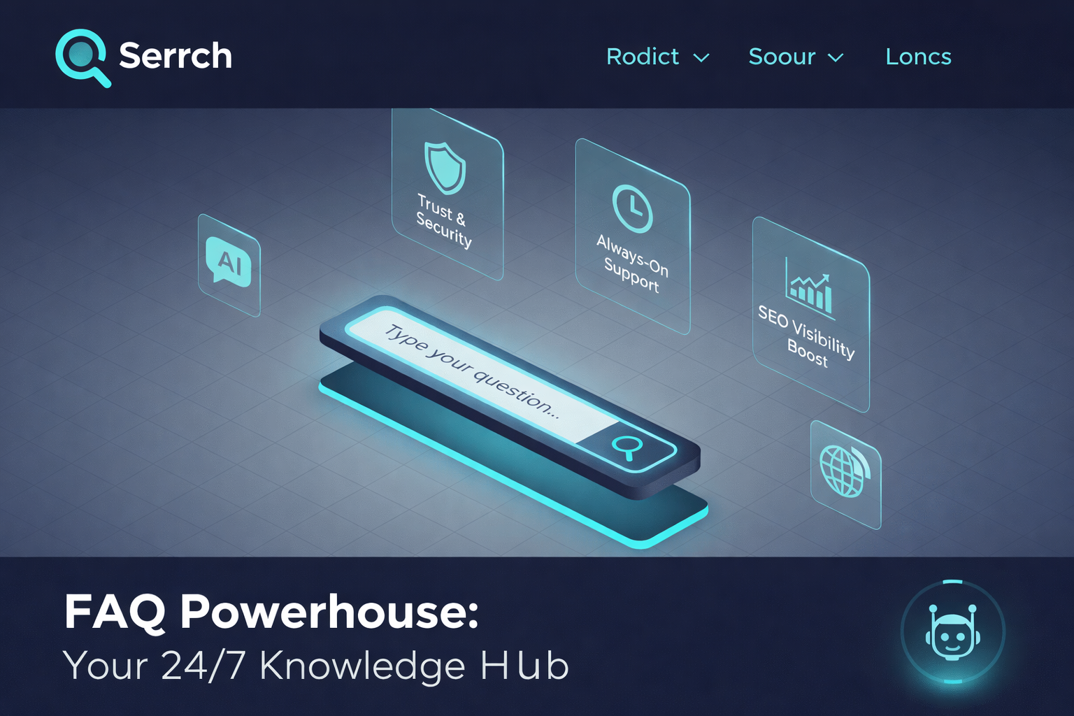
Why FAQ Templates Matter for Customer Service
So why invest time into crafting a smart FAQ template instead of just dumping a list of questions on a page?
Because a strategic FAQ directly improves your customer service.
Here’s how.
1. Always‑On Accessibility
Your FAQ page is working even when your support team is asleep.
It’s a self-service resource available 24/7, making it especially valuable for:
-
International customers across different time zones
-
Users who browse after work or late at night
-
People who prefer not to contact support at all
2. Consistent Accuracy
A well-maintained FAQ becomes a single source of truth for common questions. Everyone—customers, agents, sales reps—can refer to the same clear, approved answers.
That means:
-
Fewer miscommunications
-
Consistent responses across channels
-
Less time spent rewriting the same explanation
3. Faster Problem Solving
Most customers have one priority: solve the problem fast.
If your FAQ is easy to find, simple to navigate, and written in plain language, users can:
-
Fix basic issues themselves
-
Answer pre‑purchase doubts
-
Learn how to use your product more effectively
The result? Higher satisfaction and fewer tickets clogging your inbox.
What Should an FAQ Page Include?
An FAQ page that actually works isn’t just a random list of questions. It’s a carefully structured resource built around how people search for and process information.
Here are the essential ingredients.
1. Clear, Specific Questions
Avoid vague questions like “Shipping” or “Account.” Instead, phrase questions in the exact way users would ask them, such as:
-
“How long does shipping take?”
-
“How can I reset my password?”
This helps both humans and search engines understand what the page is about.
2. Concise, Straight‑to‑the‑Point Answers
Nobody wants to read a novel in your FAQ.
Your answers should be:
-
Short but complete
-
Written in plain language
-
Free from jargon where possible
If a topic is complex, summarize the key point and link to a detailed guide.
3. Logical Categories
As your FAQ grows, organization becomes critical. Group questions under clear headings like:
-
Orders & Shipping
-
Billing & Payments
-
Account & Security
-
Technical Issues
This reduces cognitive overload and helps people scan quickly.
4. Search Functionality
Once you have more than a couple dozen questions, a search bar becomes a must.
A simple FAQ search tool lets users:
-
Type in their own words
-
Jump straight to relevant answers
-
Avoid endless scrolling
5. Links to Helpful Resources
Some visitors want more depth. Use your FAQ answers as a starting point, then link out to:
-
Knowledge base articles
-
Tutorials and how‑to videos
-
Blog posts or documentation
You’re not just answering questions—you’re guiding a learning journey.
6. Visible Contact Information
Even the best FAQ won’t cover every edge case.
Always give users a clear next step if they still need help:
-
“Didn’t find what you need? Contact us here.”
-
Buttons for live chat, support tickets, or phone support
-
Links to community forums if you have them
Where Should You Publish Your FAQ Template?
Your FAQ content is only useful if people can find it. Placement matters just as much as structure.
Here are strategic locations to publish or link your FAQ.
1. Main Website Navigation
Add “FAQ” or “Help” to your main navigation or footer menu so users can access it from any page.
This signals that you’re transparent and ready to answer questions.
2. Product or Service Pages
Include mini FAQ sections directly on product or service pages.
Use them to address:
-
Common pre‑purchase objections
-
Feature clarity
-
Warranty, returns, or usage questions
This keeps users on the buying journey instead of forcing them to hunt for answers elsewhere.
3. Checkout Process
The checkout page is where doubts kill conversions.
Link your FAQ near:
-
Shipping details
-
Coupon or promo fields
If customers can quickly confirm things like “Do you accept UPI or credit cards?” or “What is your return policy?”, they’re far more likely to complete the purchase.
4. Customer Account Portal
If you have a logged‑in dashboard or portal, build an FAQ right into it.
Focus on:
-
Billing questions
-
Subscription changes
-
Order tracking
-
Profile and security settings
This supports existing customers in managing their relationship with your brand.
5. Social Media and Email Signatures
Make your FAQ work outside your website too.
You can:
-
Add FAQ links in social media bios (“Got questions? Start here.”)
-
Include a link in your support team’s email signatures
-
Direct users to specific FAQ articles in replies and DMs
This speeds up resolution and keeps answers consistent.
18 Inspiring FAQ Template Examples
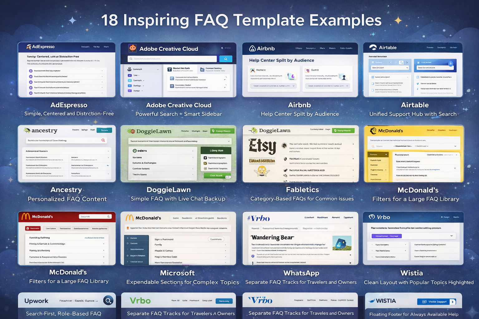
Let’s look at how real companies design FAQ pages that are clear, engaging, and on‑brand. Use these as inspiration, not as blueprints to copy.
1. AdEspresso: Simple, Centered, and Distraction‑Free
AdEspresso offers Facebook and Instagram advertising tools, and its FAQ page mirrors that clarity.
-
Clean, centered layout with no clutter
-
A focused list of core questions
-
Each question links out to a more detailed blog or guide
If users still can’t find what they need, the page makes it easy to jump to more resources or contact support. The big win here is confidence and simplicity—no one feels overwhelmed.
2. Adobe Creative Cloud: Powerful Search + Smart Sidebar
The Adobe Creative Cloud FAQ is built for users who don’t have time to dig.
-
A prominent search bar at the top for instant queries
-
Sidebar navigation organizing topics like accounts, billing, and apps
-
A virtual assistant to handle more complex or specific questions
This combination of self‑service and guided assistance helps users get answers fast, without scrolling through walls of text.
3. Airbnb: A Knowledge Base Split by Audience
Airbnb structures its FAQ like a mini knowledge base.
-
Content is split into two main tracks: one for hosts, one for guests
-
Each side contains curated questions with links to more detailed resources
-
Visuals and videos break down complex concepts like listing management or booking policies
4. Airtable: Unified Support Hub with Search
The Airtable FAQ is integrated into a larger help center.
-
Searchable support portal covering tutorials, troubleshooting, and FAQs
-
Questions grouped into intuitive categories
-
Deep guides embedded within the same ecosystem
This approach works perfectly for tools with a learning curve: users can search once and surface documentation, FAQs, and guides in one place.
5. Ancestry: Personalized FAQ Content
Ancestry takes FAQs a step further with personalization.
-
Logged‑in users see FAQ content tailored to their account and genetic results
-
Links to specific account settings and reports make navigation seamless
Because genealogy is deeply personal, this tailored FAQ experience feels more relevant and valuable than a generic page.
6. DoggieLawn: Simple FAQ with Live Chat Backup
DoggieLawn offers eco‑friendly dog potty solutions, and its FAQ reflects that no‑nonsense approach.
-
Straightforward questions answered with clear, concise copy
-
Accordion‑style dropdowns so users can expand only what they need
-
Live chat available during business hours for personalized help
This combo of self‑service and real‑time support is ideal for e‑commerce brands where customers may have product‑specific concerns.
7. Etsy: Separate FAQs for Buyers and Sellers
Etsy caters to two very different audiences, and the FAQ reflects that.
-
The FAQ is split into sections for buyers and sellers
-
A top‑of‑page search bar lets users quickly locate specific answers
-
A prominent “Get Help with an Order” button directs users to resolution workflows
Segmenting content prevents users from wading through irrelevant information and keeps support journeys tight.
8. Fabletics: Category‑Based FAQs for Common Issues
Fabletics uses a category‑first approach.
-
Clear headings for topics like orders, returns, exchanges, and memberships
-
Once you choose a category, you see a list of the most common questions
-
Related question lists keep users within a topic without jumping back and forth
This structure keeps the page tidy and reduces the number of clicks users need to find their answer.
9. Liquid Death: On‑Brand Humor Meets Practical Answers
Liquid Death sells canned water with a heavy dose of attitude, and their FAQ leans into that.
-
Bold, witty answers that match the brand’s rebellious tone
-
Accordion sections and gold‑colored headings for easy navigation
-
Content that’s fun to read but still crystal clear
It’s a reminder that FAQs don’t have to be boring—as long as clarity comes first.
10. Mailchimp: Educational FAQ with Strong Support Options
Mailchimp uses its FAQ to empower users, not just troubleshoot.
-
Clearly defined sections like billing, account setup, and email campaigns
-
Tutorials and how‑to guides woven into the FAQ content
-
Multiple contact options—email, live chat, and more—at the end of sections
This makes the FAQ feel like a learning hub rather than a last‑resort help page.
11. McDonald’s: Filters for a Large FAQ Library
McDonald’s keeps its FAQ efficient and approachable.
-
Users can filter questions by topics like nutrition, locations, or franchising
-
Filters help customers avoid sifting through pages of unrelated content
When your FAQ is large, filtering becomes critical to keep the experience smooth.
12. Microsoft: Expandable Sections for Complex Topics
The Microsoft FAQ handles a vast array of questions.
-
FAQs grouped by themes such as account, installation, and features
-
Expandable sections that keep the page clean while hiding deeper detail
-
Easy paths to contact support when self‑service isn’t enough
This design is especially useful for software with many versions and use cases.
13. Nintendo: Traditional Layout with Smart Jump Links
Nintendo uses a classic Q&A style but adds helpful navigation tools.
-
Questions organized by hardware, games, and account issues
-
“Jump to” lists at the top help users skip straight to relevant sections
-
Product and series‑based categorization ensures users see only content that matches their console or game
It’s a textbook example of how simple structure plus good navigation can solve complex support needs.
14. Upwork: Search‑First, Role‑Based FAQ
Upwork is a marketplace for freelancers and clients, and its FAQ reflects both sides.
-
A powerful search bar at the top suggests common queries
-
Filters for topics like “Freelancer support” and “Client support”
-
Related topic suggestions to avoid repeated searches
-
Links to support contact and community forums
This FAQ page is built for speed and relevance.
15. Vrbo: Separate Tracks for Travelers and Owners
Vrbo designs its FAQ with two main audiences in mind.
-
Sections tailored to travelers and to property owners
-
Categories under each section, such as booking, payments, and property management
-
Accordion dropdowns for smooth navigation
-
Article rating system so users can mark content as helpful or not
The ratings give Vrbo feedback to improve content over time.
16. Wandering Bear: Fun, On‑Brand FAQ with Real Value
Wandering Bear is known for its quirky branding, and its FAQ is no exception.
-
Playful, humorous tone that keeps readers engaged
-
Clear, structured answers to practical questions about shipping, products, and more
-
Links to additional product guides and resources
It proves that you can be entertaining and still deliver serious value.
17. WhatsApp: Clean Layout with Popular Topics Highlighted
The WhatsApp FAQ focuses on simplicity.
-
A dropdown table of contents that helps users jump to specific areas
-
Popular topics displayed prominently on the right side
-
A search bar for more targeted questions
This format works extremely well for widely used apps with millions of users and varied use cases.
18. Wistia: Floating Footer for Always‑Available Help
Wistia is a video hosting platform with a thoughtful FAQ design.
-
A floating footer that keeps the search bar and support ticket button in view
-
Clear categories like video management, analytics, and integrations
-
Straightforward layout with strong calls to action
Users never feel “stuck” because help is always one click away.
How to Create an FAQ Page: 5 Best Practices
Creating an FAQ page isn’t just about dumping content into a template. You need a plan.
Here are five best practices to follow.
1. Use Real Data to Decide What to Include
Guesswork is your enemy.
Use tools like:
-
Google Analytics
-
Google Search Console
-
Your help desk or support platform
-
Live chat transcripts
Look for recurring questions, search terms, and themes. Those become your FAQ topics and headings.
2. Keep It Simple and Focused
Resist the urge to include every possible detail in the FAQ itself.
-
Answer the core question clearly
-
Avoid overly technical language where possible
-
Link to deeper content if someone needs more context
Your FAQ is a shortcut, not a full manual.
3. Make It Mobile‑Friendly
A huge chunk of your audience will read your FAQ on their phone.
So make sure:
-
Text is readable on small screens
-
Buttons and links are easy to tap
-
Accordions and menus work smoothly on mobile browsers
If your FAQ is hard to use on mobile, you’ll lose people exactly when they need you most.
4. Always Offer Contact Options
No matter how good your FAQ is, some users will still need a human.
Give them clear options such as:
-
“Still need help? Contact us here.”
-
Live chat buttons
-
Support ticket forms
-
Phone numbers or messaging links
This turns your FAQ into part of a larger support ecosystem, not a dead end.
5. Monitor Performance and Improve Over Time
Your FAQ is a living asset, not a one‑and‑done project.
Review:
-
Which questions get the most views
-
Which pages users bounce from quickly
-
What people search for in your FAQ search bar
Then:
-
Add missing questions
-
Clarify confusing answers
-
Remove or merge outdated content
Continuous optimization keeps your FAQ relevant, accurate, and useful.
Common FAQ Page Mistakes to Avoid
Even good brands slip up with their FAQ pages. Here are some pitfalls to steer clear of.
1. Overloading Answers with Too Much Information
If your answer runs several paragraphs, most users will skim or abandon it.
Solution:
-
Keep answers tight and focused
-
Use bullets where it helps clarity
-
Link out for long explanations
2. Poor Organization or No Categories
A “wall of questions” is frustrating to navigate.
Solution:
-
Group questions into clear categories
-
Use headings, spacing, and accordions
-
Add a search bar if you have many questions
3. Letting Content Go Out of Date
An outdated FAQ is worse than no FAQ—it actively misleads users.
Solution:
-
Set a schedule to review FAQs (monthly or quarterly)
-
Update policies, pricing, and procedures promptly
-
Remove irrelevant or obsolete questions
Need Help? Why Work with Websfirm on Your FAQ Strategy
If building or optimizing your FAQ page feels overwhelming, you don’t have to tackle it alone.
An expert partner like Websfirm can help you:
-
Research what your audience is really asking
-
Plan a smart structure and layout tailored to your business
-
Write clear, human, SEO‑optimized answers
-
Integrate FAQs into your overall customer service and SEO strategy
A well‑designed FAQ page is more than a support tool—it’s a quiet sales assistant, trust builder, and traffic driver working 24/7 in the background.
Conclusion
An FAQ page might look simple on the surface, but behind the scenes it can transform how customers experience your brand.
With the right FAQ template, you can:
-
Answer common questions quickly and clearly
-
Reduce pressure on your support team
-
Improve conversions by removing friction
-
Boost your visibility in search results and AI‑generated answers
Start by choosing the right format, organizing your questions, and writing concise, helpful answers. Then keep improving based on real user data.
When you treat your FAQ as a living, strategic asset—not an afterthought—you’ll see the difference in customer satisfaction, support efficiency, and bottom‑line results.